

Problem
Cryptocurrency wallets are often hard for everyday users. They can feel technical, confusing, and unsafe — especially around seed phrases, backups, and account recovery. Many apps also look outdated or overwhelming, which makes new users hesitant to start.
User pain points
- Intimidating onboarding — Seed phrases, backup steps, and security warnings overwhelm first-time users.
- Trust deficit — Crypto apps need to feel safe before users will store recovery phrases.
- Fragmented ODIX vision — Wallet, payments, and card spending need to feel like one cohesive product family.
- Platform consistency — The experience must work identically on Android and iOS.
Business requirements
ODIX needed a mobile wallet that:
- Feels trustworthy and easy from the first screen
- Walks users through wallet setup step by step
- Teaches security (seed phrase backup, no screenshots, safe storage) without jargon
- Fits into a larger product vision — wallet + payments + card spending
- Works consistently on both Android and iOS
Solution
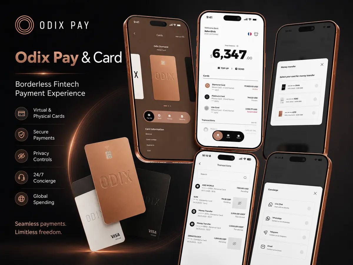
A modern, design-led Flutter app that turns a complex crypto onboarding process into a clear, guided experience.
Onboarding & welcome
Three swipeable intro screens explain Odix Wallet, Odix Card, and Odix Pay, then land users on a welcome screen with clear choices: create a wallet or import with a seed phrase.
Wallet creation
A multi-step flow covers security education, manual backup instructions, a tap-to-reveal seed phrase grid (with privacy blur), a verification quiz to confirm the user saved the phrase, and a success screen with responsible security messaging.
Wallet import
Users name their wallet, paste or enter a 12–24 word recovery phrase, and see a security reminder before continuing — with loading feedback during import.
Account protection
Optional Face ID setup and a custom 6-digit PIN keypad (create + confirm) before entering the main app.
Home dashboard
Balance overview, deposit/withdraw actions, multi-asset wallet list with live-style price data, and an empty state for transactions.
Reusable design system
Shared buttons, text fields, app bars, dialogs, colors, typography (Alexandria font family), and responsive spacing so the app scales across screen sizes.
My Role
Flutter Mobile Developer
| Area | Responsibilities |
|---|---|
| Design implementation | Translated Figma designs into production-ready Flutter UI for Android and iOS |
| Navigation & flows | Built full app navigation from onboarding through wallet setup, security, and home |
| Component library | Developed reusable UI components — buttons, text fields, app bars, dialogs, base screen layout |
| Wallet flows | Implemented wallet creation and import screens, including seed phrase reveal, backup verification, and security warnings |
| Home dashboard | Created balance display, action buttons, asset list, and transaction section |
| Custom UI | Built curved action buttons, blur overlays, bottom sheets, and styled bottom navigation bar |
| Architecture | Set up routing and state management with GetX; feature-based folder structure for future backend work |
| Responsive layout | Ensured consistent layout across phone sizes using media-query helpers |
Key Features
Onboarding & Setup
| Area | Features |
|---|---|
| Onboarding | 3-screen intro with page indicators; explains Wallet, Card, and Pay |
| Welcome | Create new wallet or import via seed phrase |
| Create wallet | Security education, manual backup guide, tap-to-reveal 12-word seed phrase |
| Seed backup | Word-order verification quiz with visual feedback |
| Import wallet | Wallet naming, phrase input, paste support, security bottom sheet |
| Security | Screenshot warning dialog, Face ID setup screen, 6-digit PIN create/confirm |
Home & Navigation
| Area | Features |
|---|---|
| Home | Total balance with hide/show, Deposit / Withdraw / Wallet actions |
| Assets | USDT, USDC, BTC, SOL with network tags and price change indicators |
| Transactions | Section with empty state when no activity |
| Navigation | Custom pill-style bottom bar (Home, Card, Menu) |
| UX polish | Loading overlays with blur, fade transitions, terms of service on key screens |
Technologies & Capabilities
| Category | Technology |
|---|---|
| Framework | Flutter (Dart SDK 3.8+) |
| Platforms | Android, iOS (also scaffolded for Web, macOS, Linux, Windows) |
| State & routing | GetX |
| UI | Material Design, custom widgets, SVG assets |
| Packages | flutter_svg, iconsax, smooth_page_indicator, flutter_spinkit |
| Typography | Alexandria (Bold, Medium, Regular, Light) |
| Design source | Figma → Flutter implementation |
| Architecture | Feature-based modules + shared Common layer |
Architecture / Workflow
ODIX Ecosystem Context
First-Time User Flow
Wallet Setup Sequence
Code Organization
Screen Inventory
| Flow | Screens | Key Interactions |
|---|---|---|
| Onboarding | 3 intro slides + welcome | Swipe navigation, page indicators, CTA to create or import |
| Create wallet | Security info, backup guide, seed reveal, verification quiz, success | Tap-to-reveal grid, blur overlay, word-order quiz with feedback |
| Import wallet | Name input, phrase entry, security bottom sheet, loading | Paste support, 12–24 word validation, loading overlay |
| Security | Face ID setup, PIN create, PIN confirm | Custom 6-digit keypad, optional biometric skip |
| Home | Dashboard, bottom nav (Home, Card, Menu) | Balance hide/show, deposit/withdraw actions, asset list |
Supported Assets (UI Phase)
| Asset | Network | UI Elements |
|---|---|---|
| USDT | Tron | Balance row, network tag, price change indicator |
| USDC | Ethereum | Balance row, network tag, price change indicator |
| BTC | Bitcoin | Balance row, network tag, price change indicator |
| SOL | Solana | Balance row, network tag, price change indicator |
Design System Components
| Component | Usage |
|---|---|
| CustomButton | Primary CTAs across all flows |
| CustomText / CustomTextField | Consistent typography and form inputs |
| BaseScreen | Shared layout wrapper with app bar |
| Curved action buttons | Deposit / Withdraw on home screen |
| Pill bottom navigation | Home, Card, Menu tabs |
| Blur overlays | Seed phrase privacy and loading states |
| Alexandria typography | Bold, Medium, Regular, Light weights |
User Flow Principles
- Educate before asking users to act (especially for seed phrases)
- Use blur, overlays, and dialogs to reinforce security
- Show loading/success states so actions feel responsive
- Keep navigation predictable with back buttons and clear CTAs
Challenges
1. Complex onboarding without losing users
Challenge: Wallet setup has many steps; users can drop off if the flow feels overwhelming.
Solution: Broke the flow into small, focused screens with clear copy and visual progress.
2. Security UX
Challenge: Seed phrases need to be visible when backing up but hidden by default.
Solution: Tap-to-reveal grid with blur overlay and screenshot warnings balances usability and safety.
3. Custom UI from Figma
Challenge: Elements like curved Deposit/Withdraw buttons, pill navigation, and blurred loading overlays required more than standard widgets.
Solution: Custom painters and clip paths to match the Figma design pixel-accurately.
4. Responsive design
Challenge: Onboarding images and layouts need to work across different screen widths.
Solution: Responsive sizing helpers so layouts adapt on phones and larger devices.
5. Consistent design system
Challenge: Many screens share the same patterns; inconsistency would slow development and hurt polish.
Solution: Reusable components (CustomButton, CustomText, BaseScreen, etc.) kept the UI consistent and easier to extend.
6. Multi-step state
Challenge: Flows like PIN entry, seed phrase reveal, and import loading needed careful transition handling.
Solution: Timed navigation and clear screen states so users always know where they are in the flow.
Final Result
Live Production Platform
Delivered Outcomes
- Polished, cross-platform ODIX Wallet mobile app UI covering the full first-time user journey — from onboarding through wallet setup, security, and the main dashboard.
- Complete Figma-aligned UI on Flutter with 15+ screens across onboarding, wallet creation, import, security, and home.
- Reusable component library and clean feature-based project structure.
- Smooth transitions, loading states, and security-focused interactions.
- Tested on Android emulator and iOS simulator.
Current Scope (UI Phase)
- Frontend and navigation are in place; blockchain, live balances, and real wallet generation are planned for a later integration phase.
- Home screen uses sample asset data for demonstration.
- Card and Menu tabs use the same home layout as placeholders for future features.
The app gives ODIX a strong, user-friendly foundation to connect real wallet services, payment features, and the Odix Card experience in the next development phase.